
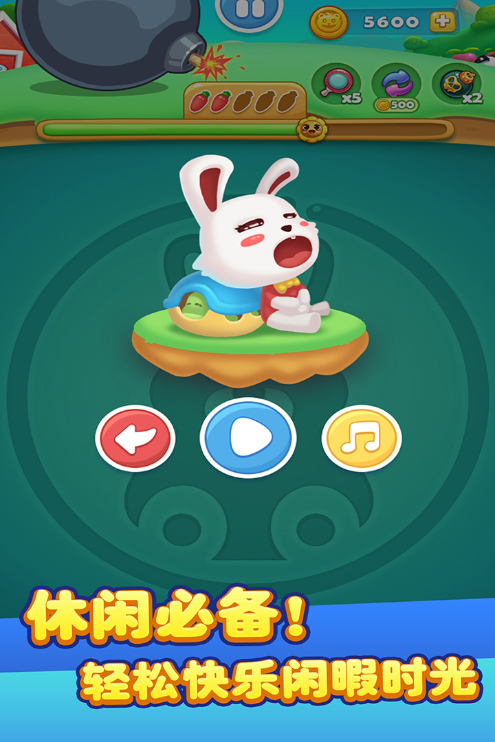
I was originally attracted by its icon, a pink and tender little bunny, which looks super cute, right? After clicking in...emmm, this interface is really hard to describe😭
How can I put it, the icon and the actual picture are completely two worlds! The color scheme of the main interface, with bright red, green, and blue colliding together, makes it feel like my grandma's sheets were spread on the screen... And the buttons have super jagged edges, as if they were drawn casually with a drawing software. What makes me cringe the most are the fruits and vegetables. The introduction says they are "cute, natural, colorful and delicious", but in reality they look as if they have been soaked in water and are soft. The shape of the strawberry seems to be crooked, and the color of the apple is also very strange. How can I put it...the saturation is too high, and it makes my eyes tired to look at it😵
However, the gameplay is really good. For Lianliankan, the sound effect when the connection is eliminated is a very healing "bop" sound. While I disliked the ugly interface, I couldn't help but play it for a long time...especially the casual mode, which is really relaxing. There is no time limit and you can connect as much as you want. I don't dare to touch the hell mode. The dense patterns make my scalp numb and I feel like I'm going to go blind hahaha
In short...if the interface of this game could be repainted and replaced with a soft and cute cream color, and the fruits could be painted a little rounder, I would definitely give it five stars! Now... four stars, after all, the gameplay is really good, and it's free with no ads, which is very conscientious💕
Are there any sisters who feel the same way? Or am I the only one who finds it ugly? 😂