
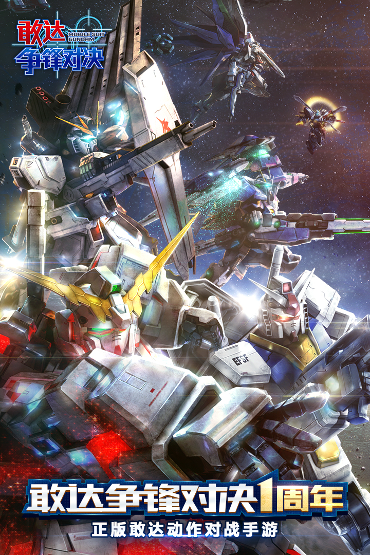
I actually wanted to experience the joy of driving a Gundam, but the dark gray metal panel of the main interface, with its densely packed buttons and values, felt like I had mistakenly entered some industrial console. The icons are also sharp and angular, and the fonts are thick and hard. They are said to be handsome, but why do I just feel so stressed... ✨
Then I entered the battle preparation interface. The three-dimensional illustration of the machine was obviously quite handsome, but the surrounding data panel and skill icons were packed together, much like my final review materials were piled in a mess on my desk. The novice guide also kept popping up that kind of dark pop-up window. I almost thought I was about to start fighting the boss... but it turned out that I kept fighting! 😣
I originally wanted to quietly rest on a cute machine, but looking at this color scheme, this font, this layout... I really can't help but wonder, does the development team think that all players like the cold military style? For me, if the interface could be made rounder, the colors brighter, and the buttons softer, then I might be more motivated to go online every day🥺
Alas, although the plot and operation are actually pretty good, every time I open the game I have to be struck by the ugly interface. I hope there will be a "healing skin" or something like that in the future and replace those big gray iron plates with small warm-colored stickers. Then I think I can work hard to become an ace pilot! 🙈
In short, the game is fun, but the interface really needs a little cute magic ~ Are there any sisters who feel the same way as me? 💕