
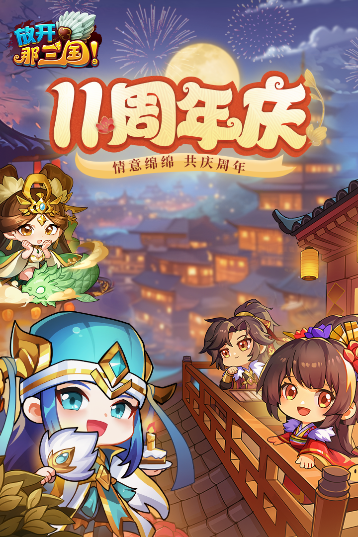
Let me start by saying that I was attracted by the Q version of the pop-up painting in it. The little shot of Lu Bu is so cute! And Sister Diao Chan's big watery eyes are so cute that I love them (≧▽≦) But! but! I really can't help but want to complain about the interface of this game...
It's the main city interface. How should I put it? It feels like the art style of QAQ, a web game from ten years ago. The background color is so earthy and golden, like a landlord's old house. It's really out of place when placed next to such cute generals. And those buttons feel like they were made casually with a drawing tool. The borders are square and square, and there is no roundness and girlishness at all. Humph!
What makes me most uncomfortable is the battle scene. The generals are obviously so cute, but as soon as the battle begins, the background becomes so dark and gray. Even the soldiers look like paper figures, not refined at all. I feel like my Guan Erye feels aggrieved standing in it😢
There is also the card drawing interface. Drawing cards should be the happiest and most anticipated moment! As a result, the special effect... was just a very ordinary golden light flashing, and then a few cards dropped. There was no cute animation at all, which made me not even excited when I drew a rare general. Alas~
But to be honest, although the interface is really ugly, I still can't bear to uninstall it. After all, the shapes of those military commanders and villains are too annoying to me. I just wanted to ask if anyone knows if this game can have a different skin or theme? Or is there any way to make the interface look better? I really want to watch cute military commanders and have a beautiful interface at the same time (╥﹏╥)
Finally, I would like to whisper, if the developers can see this post, please make the interface more cute! It's really a waste of resources to pair such a cute military commander with such a rustic main city! Otherwise, I will take my best friend and leave a bad review together. Hehe (๑•̀ㅂ•́)و✧