
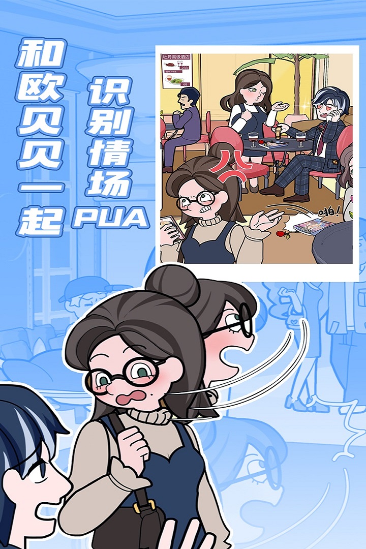
I really do love this kind of romance growth theme. The description says the art style is a cute cartoon style, and I even imagined a pink, super healing little world... But when I actually entered, what was going on with the main interface's color scheme! The saturation is way too high, with all sorts of colors piled together, like someone dumped a palette and accidentally saved it. The buttons are also big squares with sharp corners, completely lacking that soft, cozy feel—I really want to round them off 🥺.
And the character sprites—the promo images look pretty cute, but in the game, the faces come out a bit crooked, and the expressions are kind of blank. Obebe's skirt lace looks jagged like saw teeth, really not delicate at all. I play romance games to get that sweet feeling, but every time I enter the story and see this scene, I can't help but want to grab an eraser and fix it 💦.
The story itself is actually quite interesting—avoiding bad relationships, growing through challenges, the content is pretty engaging—but the interface really makes me want to quit. While playing, I was venting to my best friend, and she said it felt like I was training the game planners to seriously study UI design 😂. I just think it's such a pity; if the interface could be made cleaner and fresher, even if simpler, it would really be such a healing and wonderful game.
That said, as a casual player, I'll still keep playing because the story really hits me, and I also like the development part. But every time I see those weird buttons and color combinations, I just want to say: dear planners, please fix this interface, it's really, really, really ugly 😤. If they optimize it in the future, I'll definitely come back to praise it!